1. The Great Palette Shift: Why Cool Gray Is Out
The rise of cool gray was rooted in the pursuit of modern simplicity. Yet over time, many discovered that all-gray color schemes often felt clinical, flat, and detached—especially in rooms with limited exposure to natural sunlight.
The Move Toward Warm Minimalism

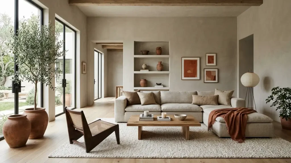
Modern design sensibilities focus on balance rather than stark contrast. Warm minimalism blends clean architectural lines with organic textures and soothing wall finishes. Instead of making a home feel smaller or overly dark, warm undertones reflect light softly, creating an inviting backdrop that complements natural wood flooring, stone surfaces, and woven textiles.
The Impact of Natural Lighting
Cool gray paint can turn harsh or slate-like under northern natural light or low-kelvin LED lighting fixtures. In contrast, warm neutrals contain subtle yellow, red, or brown undertones that keep interior spaces feeling vibrant and cozy throughout changing daylight cycles and nighttime lighting setups.
2. Key Warm Neutrals & Earth Tones Dominating Today’s Interiors
Transitioning away from cool gray doesn’t mean you have to return to the heavy, yellowed tans of the late 1990s. Today’s warm color palettes offer refined sophistication across several versatile shades:
Creamy Taupes & Warm Greiges
If you love the versatility of gray but want to eliminate its starkness, warm greiges and taupes provide the ultimate balance. Brands featured by Sherwin-Williams offer adaptable taupe bases that harmonize open-concept floor plans while bridging the gap between existing cool-toned furniture and new warm accents.
Earthy Terracotta, Ochre & Clay
Muted terracotta, burnt clay, and mustard ochre bring organic energy into residential spaces. Used as accent walls in living rooms or full wall treatments in powder rooms and bedrooms, these earthy shades foster a deep connection to nature and rustic artisan design.
Rich Espresso & Deep Chocolate Browns
Dark colors are making a dramatic comeback. Deep espresso, cocoa, and chocolate brown are taking over spaces traditionally reserved for navy blue or charcoal gray. Applied in home offices, studies, or dining rooms, rich brown tones add tailored luxury without feeling cold or harsh.
3. Professional Application Techniques for High-Impact Results
Choosing the right paint shade is only half the equation; applying it thoughtfully elevates the overall finish and flow of your home.
Color Drenching for a Seamless Look
One of the most popular application techniques recommended by major paint manufacturers like Benjamin Moore is “color drenching.” This strategy involves painting walls, baseboards, door frames, window trims, and even ceilings in the same warm neutral shade—sometimes varying only the sheen level. Color drenching blurs room boundaries, making ceiling heights feel loftier while surrounding the room in a cohesive, calming wash of color.
Two-Tone & Architectural Contrast
For homes rich in architectural character—such as crown molding, wainscoting, or custom built-ins—pairing soft cream or warm greige walls with darker taupe or brown trim creates subtle contrast. This approach highlights craftsmanship without relying on high-contrast stark white trims.
4. Selecting the Right Paint Sheen and Testing Samples
 Before committing to a full interior repaint, consider how sheen level and undertones interact within your home’s unique layout:
- Matte & Flat Finishes: Ideal for ceilings and low-traffic living areas. Flat finishes absorb glare, letting rich earth tones display their pure depth.
- Eggshell & Velvet Finishes: Perfect for high-traffic living rooms and hallways. They offer subtle washability while maintaining a smooth, non-reflective appearance.
- Satin & Semi-Gloss Finishes: Best reserved for interior doors, baseboards, trim, and kitchen or bathroom cabinetry.
Always test paint swatches directly on your walls across multiple walls and observe them at different times of day. Under warm evening light, a shade may reveal beautiful golden undertones, while morning sunlight might draw out soft beige hues.
Ditching cold grays in favor of warm interior paint colors brings fresh personality, comfort, and timeless warmth to every square foot of your home. Whether you’re refreshing a single bedroom or updating your full home interior, embracing warm earth tones is a proven way to modernize your living environment.